#seniorartdirector #artdirection #design
#artdirector #artdirection #design #redesign
#conceptdesign #poster #independent #movietheater
#artdirection #redesign #design
#branding #brandcollateral
#creativedirector #artdirection #design
#contributingdesigner#design
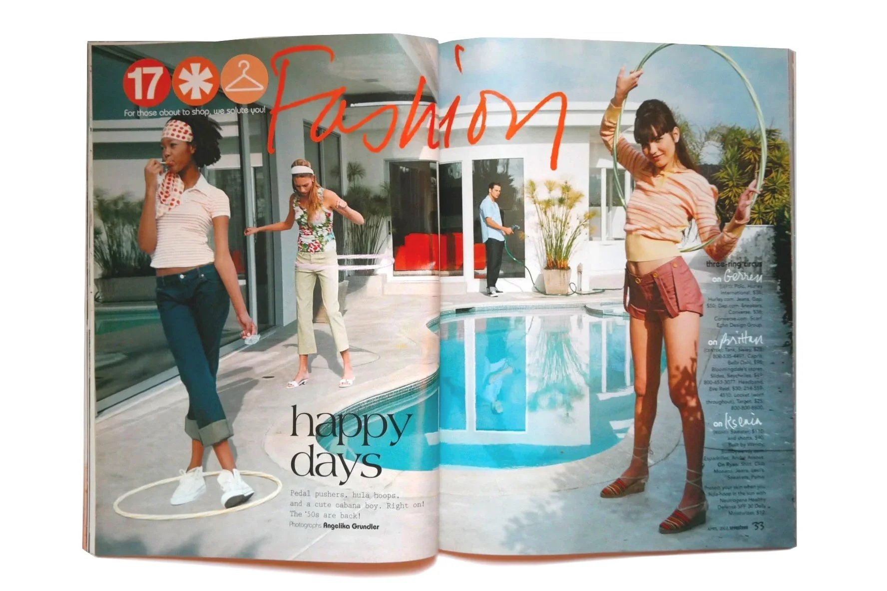
#artdirection #design #specialissue #hearstpublications
#designdirector #covers #features #departments
#conceptdesign #branding
#relaunch #artdirection #design
#consulting #artdirection #design #singleissue #hearstpublications
#redesign #artdirection
#branding #brandcollateral #design
#freelancedesign #editorial
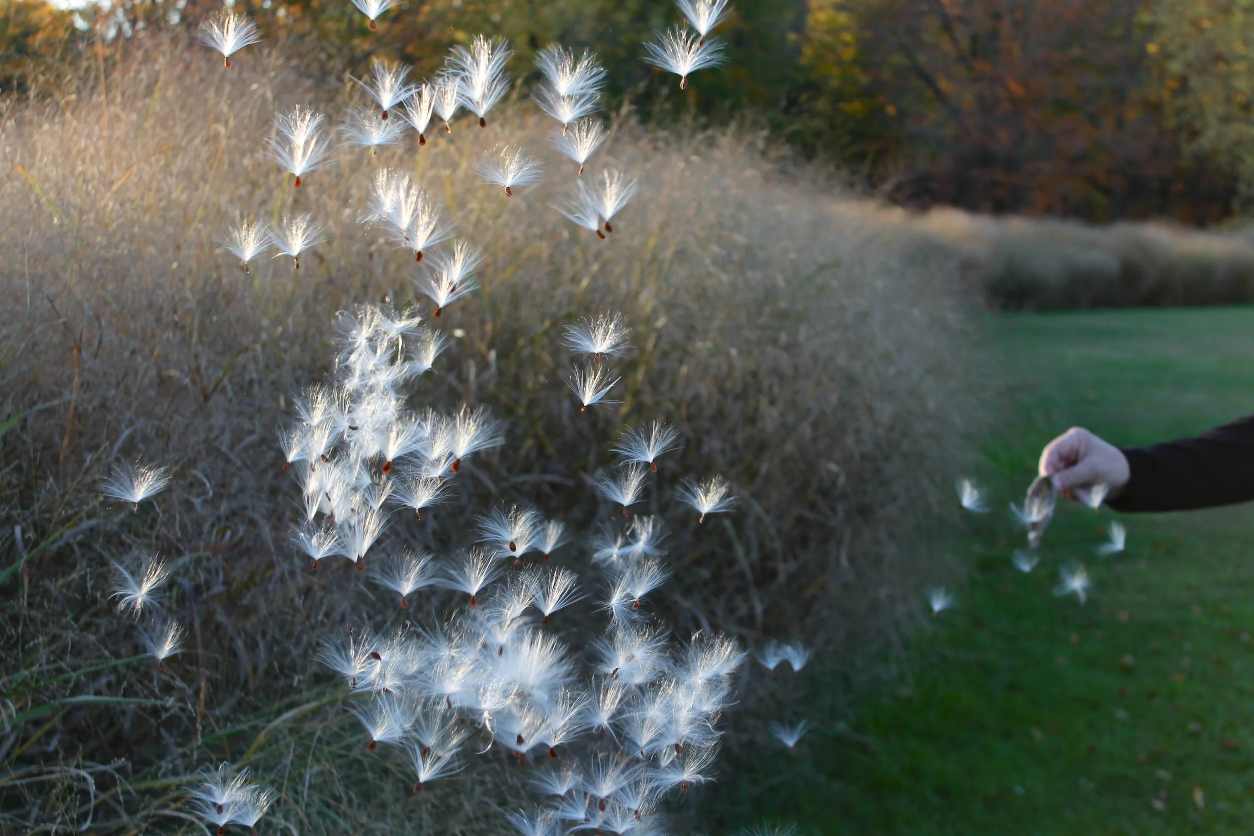
#photography #america #ongoingproject